Case study · 2021
Onboarding took a month. That's not a training problem — it's a design problem
Company
Ricochet360
Role
UI/UX Designer · Eleken
Scope
CRM · Usability ·
Informational Architecture
Timeline
2021
Overview
The product
A CRM built for sales teams on calls
Ricochet360 is a CRM and auto-dialer for sales teams — the kind of software someone has open all day, every day, as they work through call lists, log notes, update records, and manage their pipeline. It's not a tool people dip in and out of. It's the centre of a salesperson's working day.
That makes the stakes high. A confusing layout or a poorly grouped form doesn't just slow someone down — it makes an already pressured job harder, leads to errors, and erodes confidence in the tool.
CRM
Progressive disclosure
Usability
Field design
My role
UI/UX designer embedded via Eleken
I worked on this project as a designer at Eleken, a design agency embedded into product teams. My focus was the most-used workflows in the platform — the screens and interactions sales reps encounter dozens of times a day — with the goal of reducing the learning curve and making confident use the default, not the exception.
↓ errors
Error rates dropped
after redesigning field grouping and the on-call screen
↑ confidence
New users felt more confident
navigating the platform after the changes
1 month
Onboarding time
— the problem the redesign was built to address
The problem
Starting point
A month to onboard. Not a training problem
New sales reps were taking up to a month to feel comfortable using Ricochet360. That's an enormous amount of time for someone in a role where productivity matters from day one. The instinct might be to add more training, better documentation, or onboarding walkthroughs. But the real problem wasn't that users didn't understand the product; it was that the product was hard to understand.
"Onboarding a new user took a month. That's not a training problem. It's a design problem."
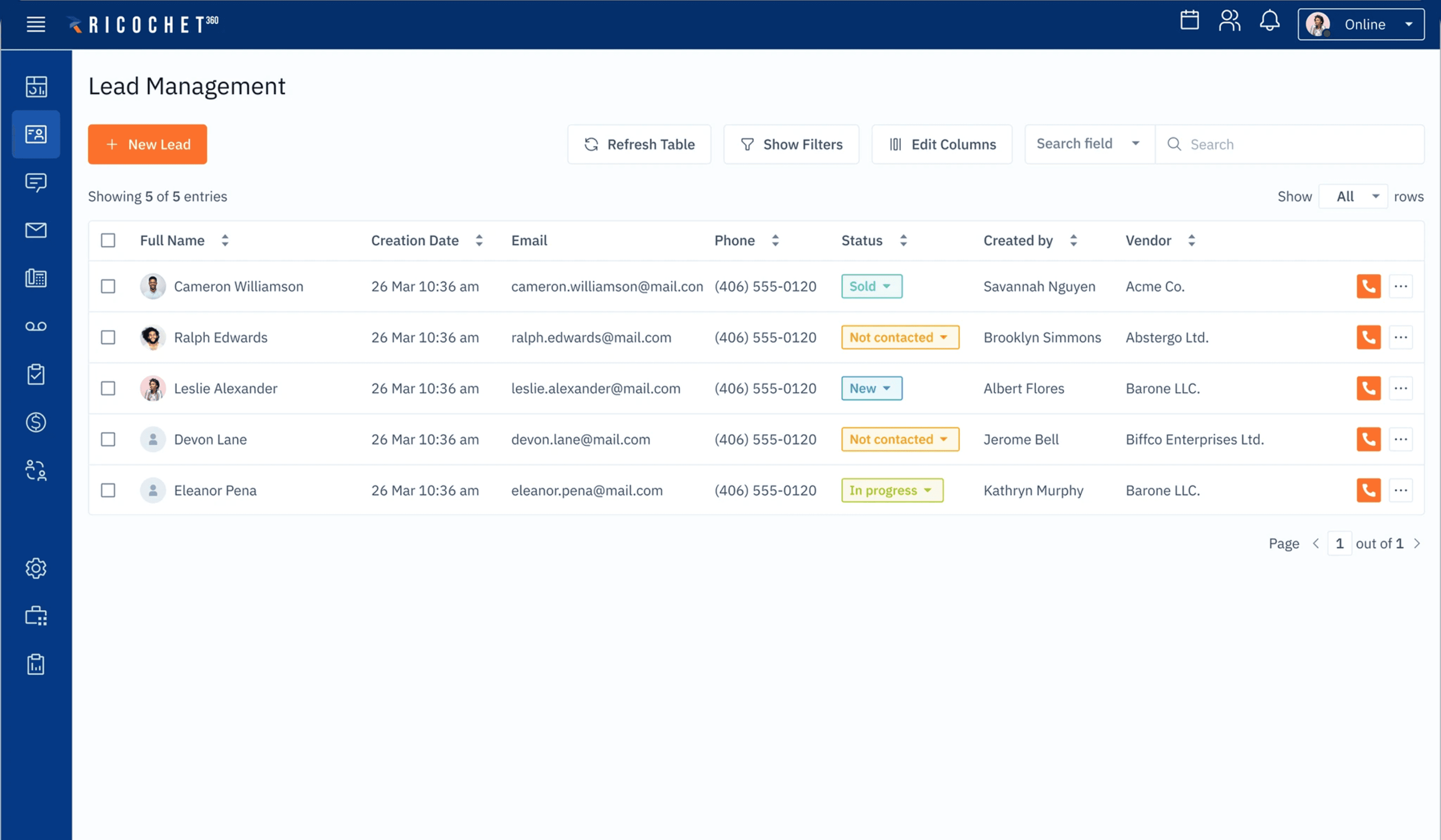
The workflows sales reps used most — working through call lists, updating contact records, logging activity — were cluttered with information and options that weren't relevant to what they were trying to do at that moment. Everything was visible all the time, which made the most important things harder to find.

The original on-call view — Scripts - most important during the call - are hidden
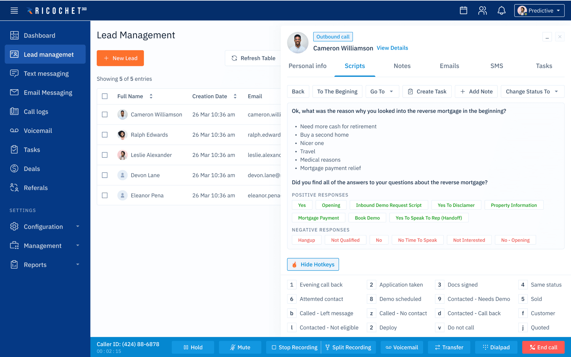
The redesigned view — prioritised actions, secondary fields collapsed
Design decisions
Approach
Three changes to the most-used workflows
Rather than a wholesale redesign, the work focused on the interactions sales reps hit most. The goal was surgical: identify what was making those workflows hard, and fix it. Three decisions made the biggest difference.
Decision 01
Progressive disclosure
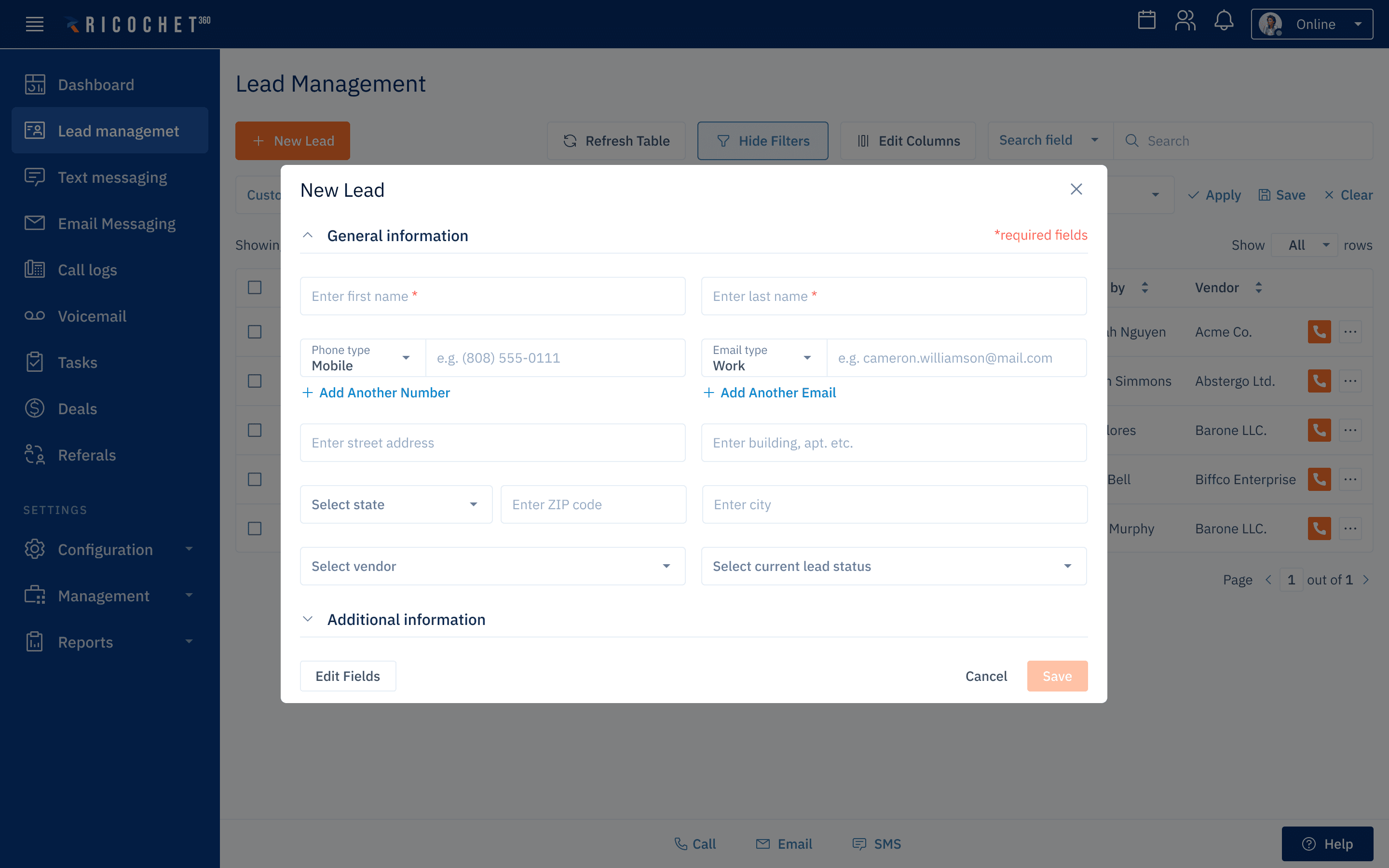
Surface the options that matter for what the user is doing right now. Advanced settings, edge-case fields, and secondary actions move out of the primary view and appear only when relevant. Less visual noise means faster orientation, especially for someone still building a mental model of the product.
Decision 02
Smarter field grouping
Related fields placed together, in the order a rep naturally works through them on a call. Grouping reduces the cognitive effort of scanning a form — when fields are logically connected, filling them in starts to feel like following a natural sequence rather than hunting for the next piece of information.
Decision 03
A decluttered on-call screen
The on-call screen is the most high-pressure moment in a rep's day — they're on a live call, with a real person, and the interface has to support them, not distract them. The redesigned view strips back to what a rep needs: contact details, the right input fields, and the most common next actions.
Only necessary fields are visible, required fields highlighted

Lead Management

Text Messaging

Email Messaging
Reflection
What I learned
"More training" is rarely the answer
The instinct when users struggle with software is often to add more explanation — better docs, onboarding flows, tooltips. This project reinforced something I've come to believe strongly: when people can't use an interface, the interface is usually the problem. Documentation can help users understand what's there, but it can't fix an interface that requires too much of them in the first place.
The other thing this project made clear is how much the context of use matters. A CRM form that's fine to fill out in a quiet office becomes a real problem when you're filling it in mid-conversation with a customer. Designing for the actual moment of use, not the ideal scenario, changes what 'good' looks like significantly.
baida.masha@gmail.com