Building a skincare routine tracker worth opening
Pielio is a personal skincare-routine tracker. Build an AM/PM routine from the products you actually own, check it off morning and night, and keep a record of what you've used with a rating and a note. I wanted an app you'd open without sighing first.
A few things shaped how I built it: two years running an e-commerce business selling skincare products, being a skincare freak myself, and building it live with Claude Code instead of working from static mocks.
You can check out the app at pielio.netlify.app.
Sticky notes on bottles, or giving up entirely
The two patterns behind Pielio came from two different places.
The first came from the store. I ran a skincare e-commerce shop for two years and spent a surprising amount of it talking to customers about their routines. Some had five or more active products on different schedules: a retinol on certain nights, a mask once a week. They coped with sticky notes on bottles or a checklist taped inside the bathroom cabinet.
The second came from my own research into how people actually live with skincare: YouTube videos, articles, and especially the comment sections under them. That's where a different kind of struggle kept showing up. These people had a dead-simple routine and knew exactly what to use, but on a hard day even applying a cream felt like a big step. The PRD has a name for this segment: "low-energy / mental-health-aware users."
No handoff between design and build
I write the PRD, then build directly in the browser with Claude Code. There's no separate design phase before the build phase. It's one continuous loop: every decision gets checked against a real, running screen instead of a static mockup.
Claude writes the code. My job is everything around it: deciding what to build and in what order, spotting what's wrong on a real screen, turning "this feels off" into a specific instruction, and writing settled decisions into the project's rule files so they hold. The design work moved to the edges: into the spec before a screen exists, and into the review once it renders.
Remembering isn't the hard part. Showing up is.
Two different problems, really. One is remembering what goes where and when: AM vs PM, which days, what you already tried and liked. The other is just showing up, especially when you're tired or struggling.
The second is the one I kept finding in comment sections: people who knew exactly what to use and still couldn't make themselves do it on a hard day. A reminder doesn't fix that. The app has to make doing the routine feel lighter than skipping it.
Three slides, zero questions
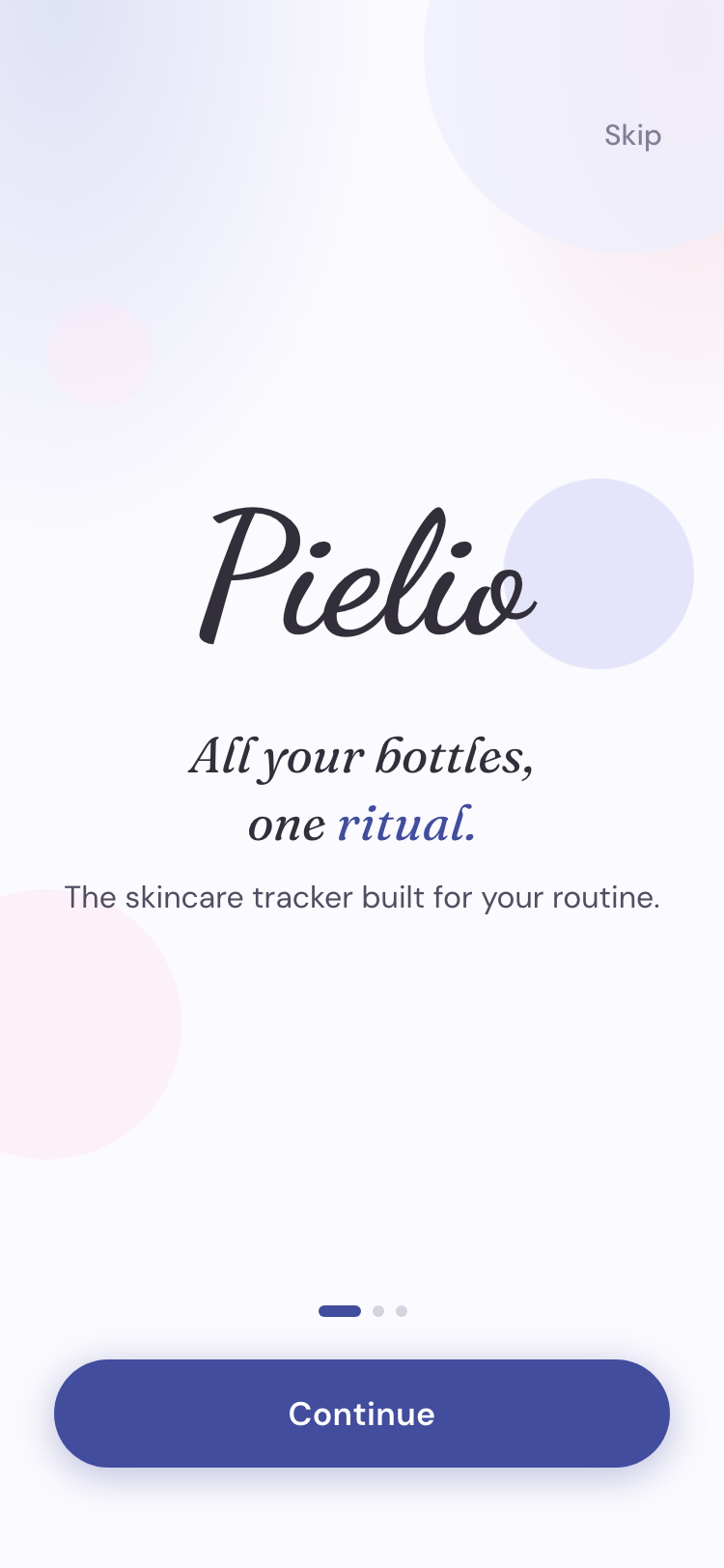
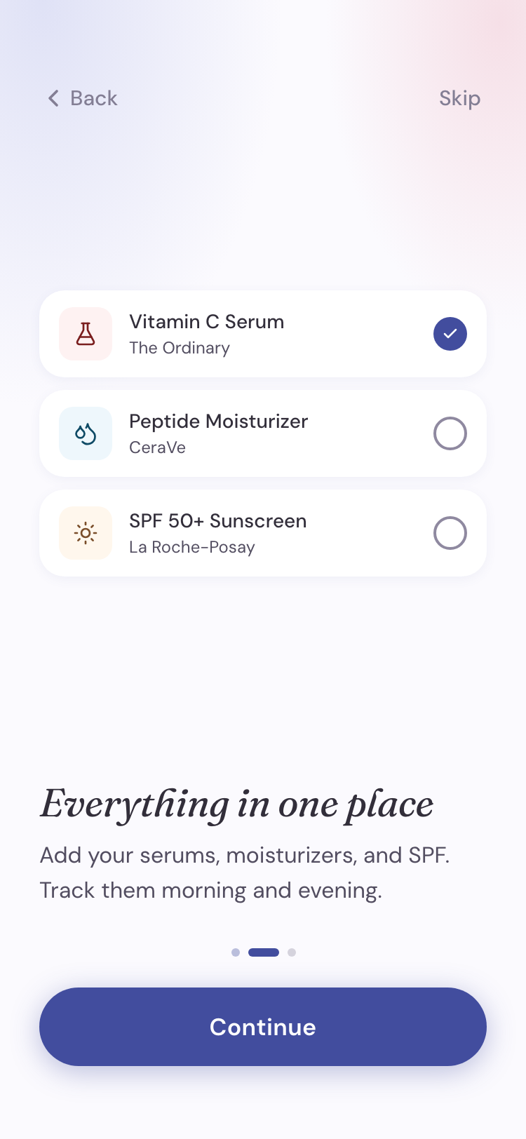
Onboarding is built around one decision: no questions. Many apps in this space open with a long intake quiz, skin type, concerns, goals, before you've seen anything. I wanted the opposite feeling, short, fun, informative enough to make you curious what's next. So it's three slides and you're in.
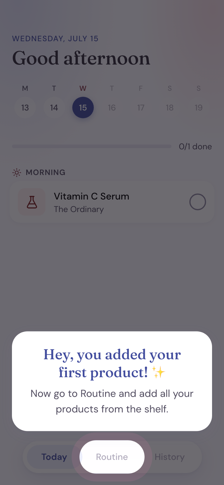
The second decision: nobody should land in an empty app. Straight after the slides, the user is guided into adding their first product, and a spotlight coach-mark then points at Routine, where that product lives. By the time onboarding is over, there's already something real on the screen.
Three screens, one daily habit
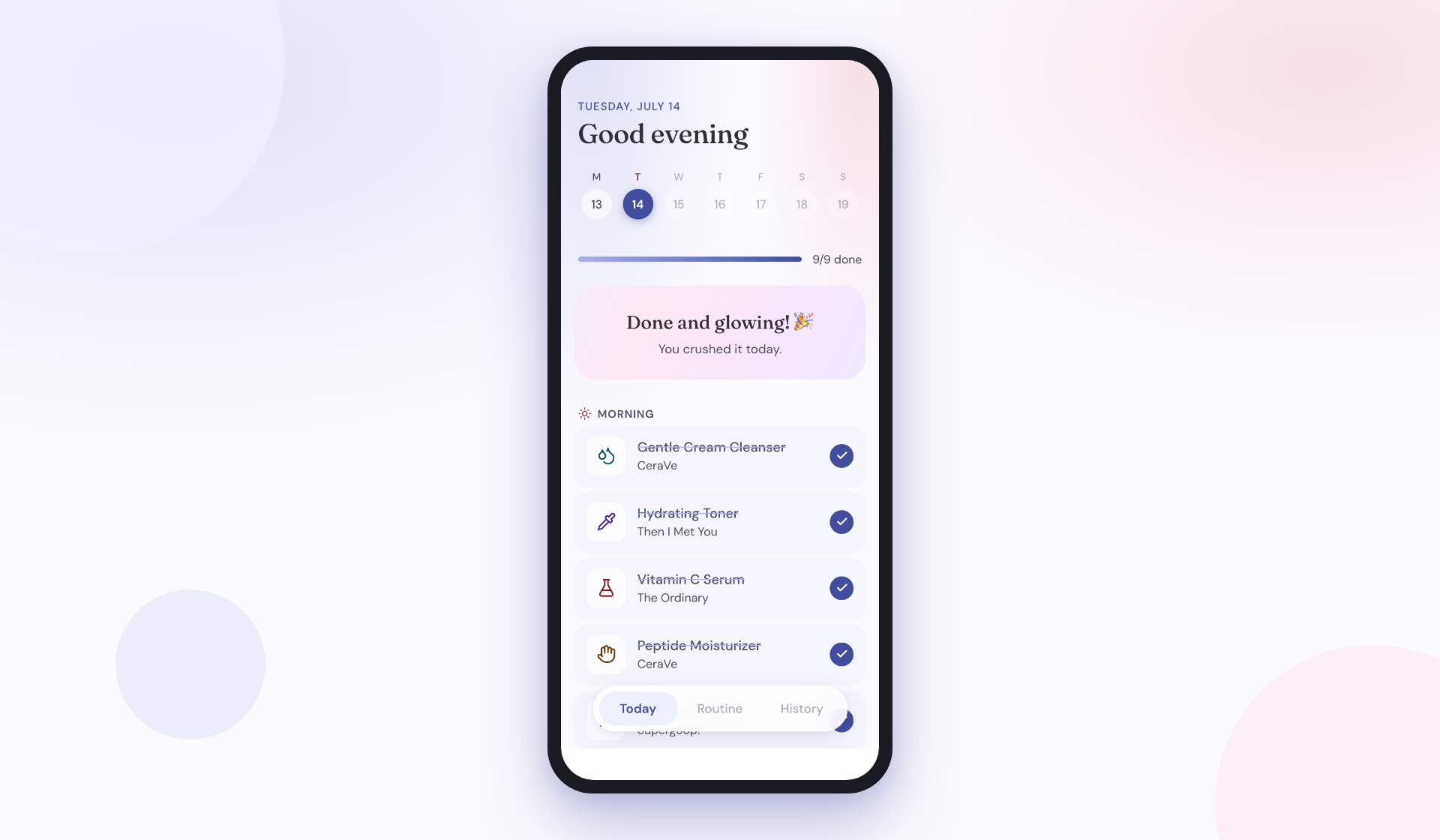
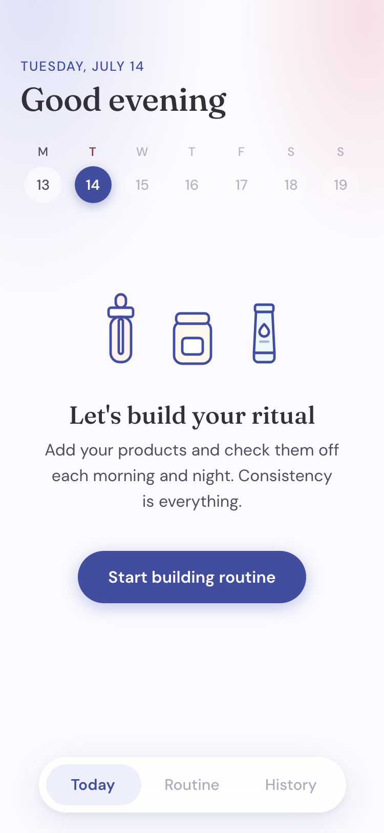
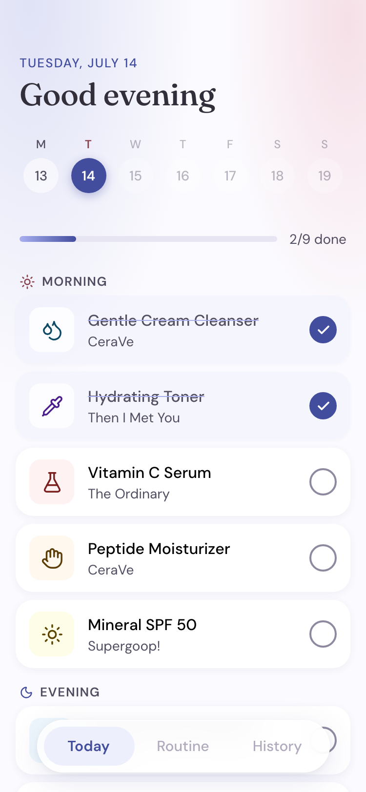
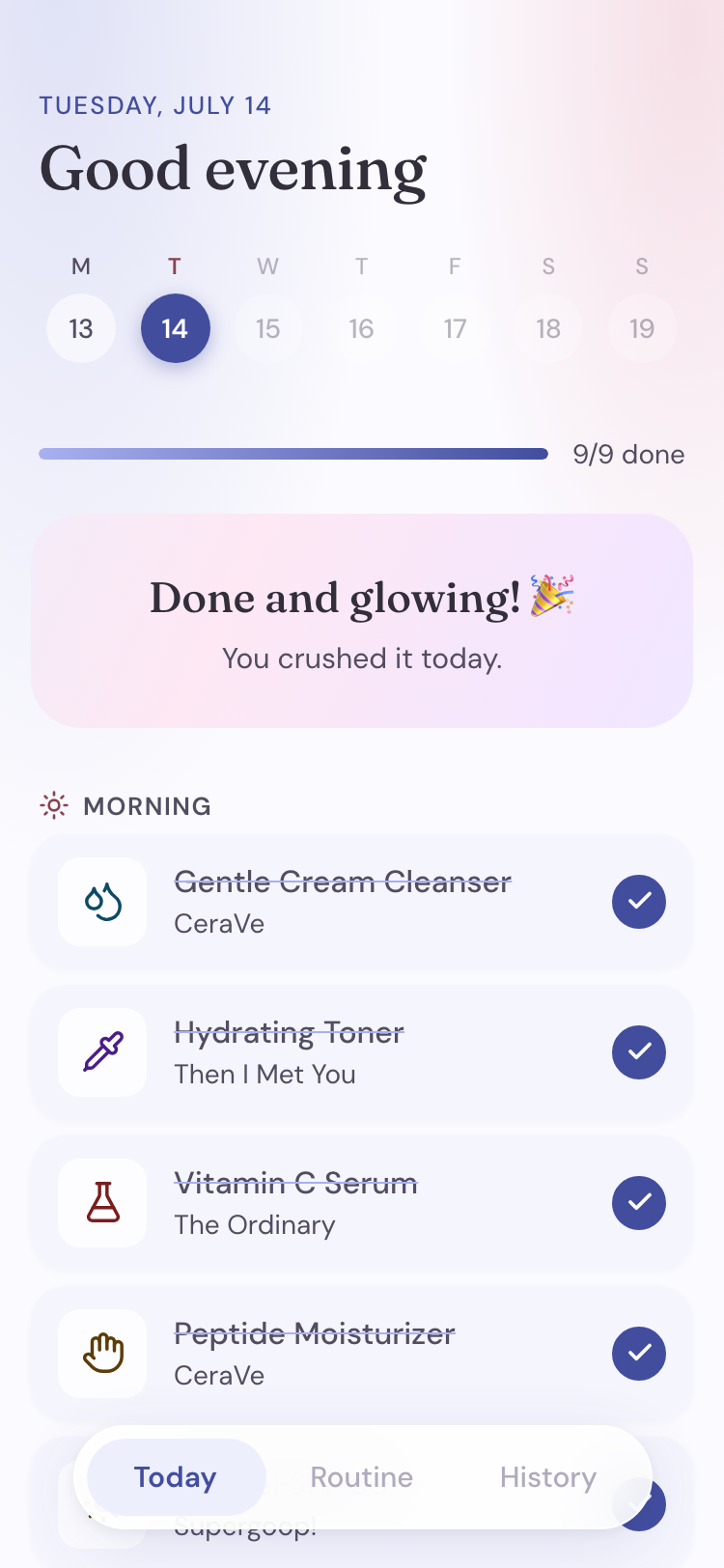
Today is the daily AM/PM checklist and the app's home screen: a progress bar, the current week, and a tap-to-check list.
This is the screen that has to solve the motivation problem. Checking off a step takes one tap. The progress bar fills as you go and finishing sets off a small celebration. I left out streak counters and guilt copy on purpose, so a skipped day costs nothing beyond the day itself. Someone opening the app after a rough week sees one thing: what's left tonight.
Your shelf, in the right order
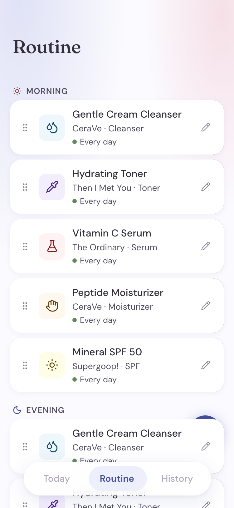
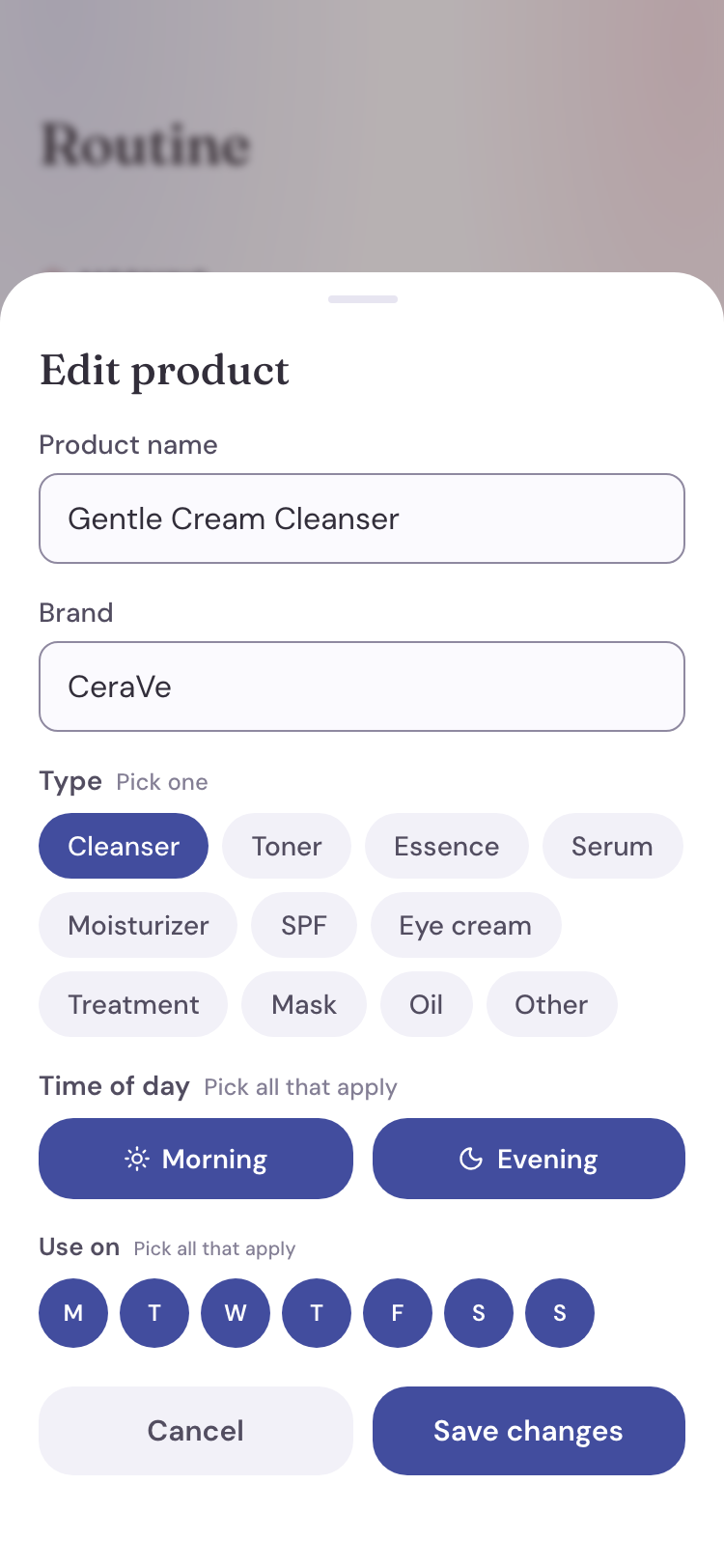
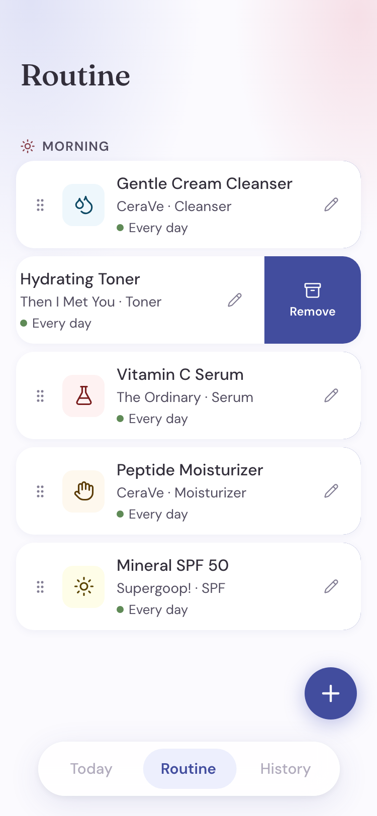
Routine is the AM/PM builder. New products auto-sort into canonical skincare order, drag to reorder manually, tap the pencil for a full edit sheet (name, brand, type, schedule), and swipe left to remove a product — it moves to History, nothing is deleted.
What worked, with a way back
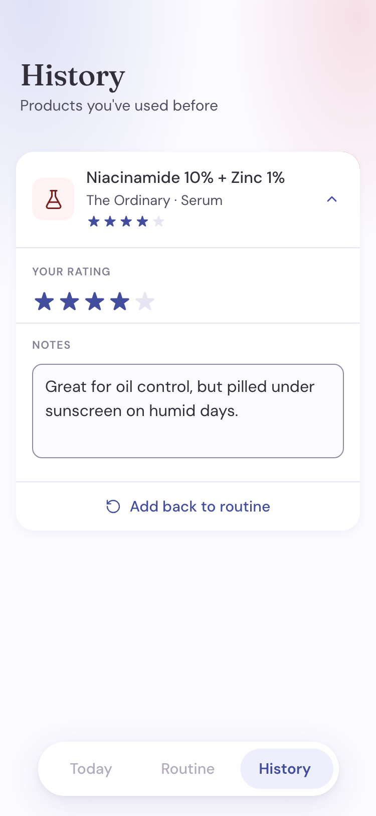
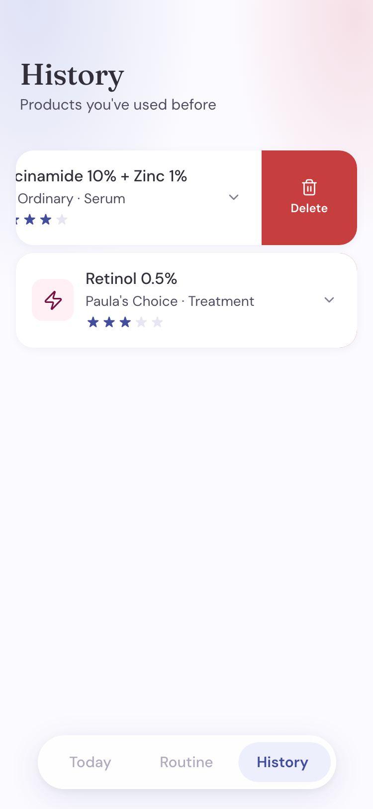
History is the archive: everything you've removed from an active routine, with a rating and notes, so you remember what worked before repurchasing.
Watching a stranger use it for the first time
Goal: find out where a new user gets stuck in the core loop, onboarding through building and checking off a routine, and gauge interest in a few future ideas.
Flow: a short moderated session. Open the app, work through a few goal-based tasks without being told where to tap, then sort future-feature ideas by how useful they'd be.
Reversible removal isn't the same as deleting
The last two findings pointed at a decision I hadn't actually made: in this app, "remove" means two different things. Taking a product out of a routine is reversible. It moves to History with its rating and notes, and can come back anytime. Deleting it from History is not. The build treated both the same way: red trash icon, scary confirmation sheet. No wonder testers couldn't tell them apart.
So the two actions stopped sharing a look. Removal got an archive-box icon, calmer copy ("moved to History, add it back anytime"), and a swipe-left gesture borrowed from Mail and Reminders. Delete kept the red trash icon and an explicit "this can't be undone."
The same split fixed the third finding. History items got a one-tap "add back to routine" control, so returning a product is the removal gesture run in reverse instead of re-typing everything from scratch.
Tracking usage
PostHog is now wired into the app, so the next round of decisions gets real usage data behind it. The first questions I'm watching: do people come back the next day, how often a started routine actually gets finished, and where in the routine builder people stall.
Building the system while still building the product
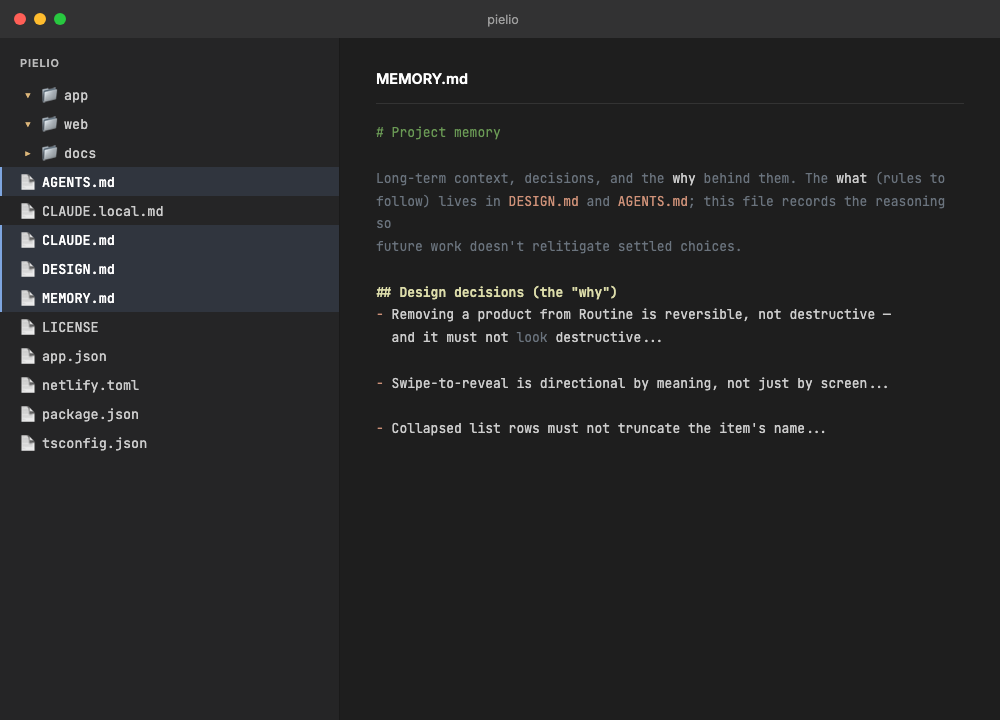
The design system settled mid-build. Building solo and fast meant some rules got discovered instead of decided. The removal vs deletion distinction is the clearest example: the inconsistency shipped first, testing exposed it, and only then did it become a written rule in DESIGN.md.
Feedback arrives vaguer than fixes need to be. Turning "that felt confusing" into a specific change (which word, which icon, which missing confirmation step) took more digging than the feedback itself gave me.
Staying the decision-maker at AI speed. Claude Code produces a plausible screen faster than I can evaluate one. The discipline was refusing to accept output just because it rendered. Every screen had to pass the same judgment a static mockup would, and the moments I couldn't explain why something felt wrong were the moments to slow down.
Sorting what's next from what can wait
The list mixes my own ideas with requests from testers. I sorted it by one question: does this make the daily loop stronger, or does it just add surface area? That's also why streaks landed in nice to have rather than must have. For the low-energy user this app cares about most, a broken streak punishes exactly the person it's meant to help.
- Barcode scan
- "What did I use yesterday?"
- AM/PM reminders
- Recommendations based on skin type and skin concerns
- Usage guide
- Export for dermatologists
- Pairing suggestions
- Skin reaction notes
- Community pairings
- Guided starter routine
- Running low / repurchase list (needs a clearer tracking mechanism first)
What I'd set up on day one, next time
Working with Claude Code taught me as much about process as about the product. Everything below I figured out halfway through and wish I'd had from the start: