Case study · 2020 – 2021
Mid-launch, no designer. Investor demos in weeks.
Company
Astraea
Role
Junior UI/UX Designer · Eleken
Scope
Navigation · Feature design · Cloud IDE
Timeline
2020 – 2021
Overview
The product
Geospatial analytics for people who work with satellite data
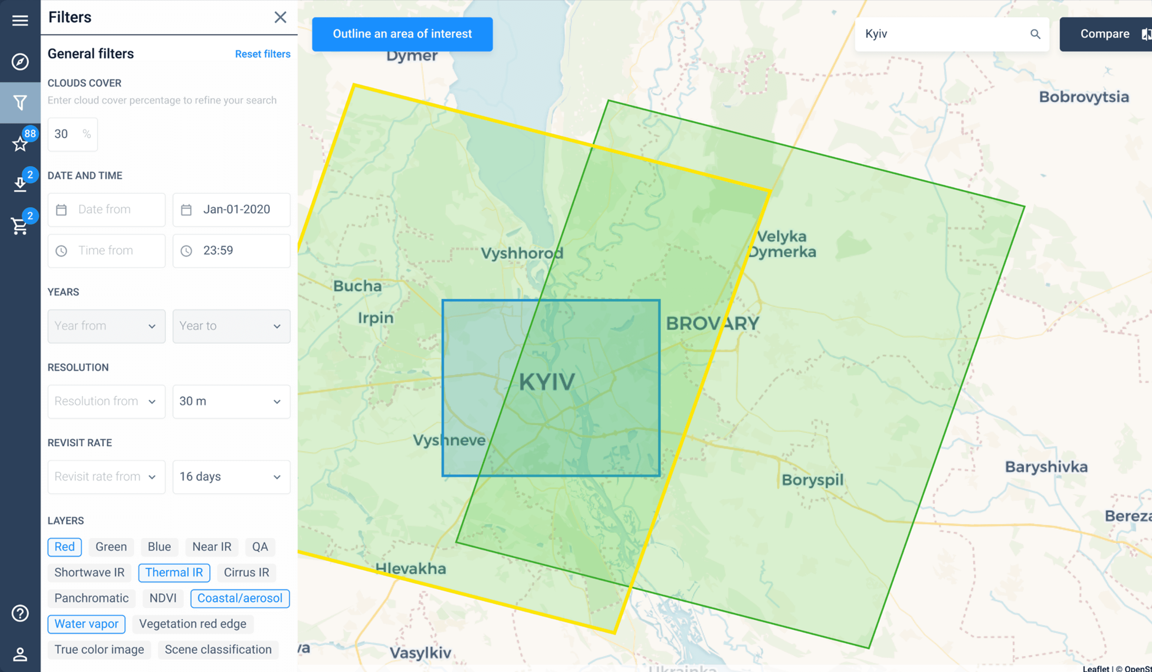
Astraea is a cloud-based platform for working with earth observation and satellite data. Their users — researchers, data scientists, government analysts — use the platform to ingest, process, and analyse satellite imagery at scale. The product sits at the intersection of GIS tooling, data engineering, and scientific computing: technically complex, with a user base that expects precision.
When I joined, the platform was mid-launch. The engineering team had built substantial functionality, but without a designer on the team, the product had accumulated design debt. Screens had grown organically to accommodate new features without a consistent system or information hierarchy behind them.
SaaS
Geospatial
Feature design
Navigation
Cloud IDE
Investor-ready
My role
Embedded designer via Eleken — the team's first design resource
Eleken placed me as a dedicated team extension. The brief was immediate and high-stakes: investor demos were scheduled and the product needed to be ready to impress. That meant working fast, prioritising ruthlessly, and making design decisions that would hold up under scrutiny from people who fund companies for a living.
I worked across three parallel tracks: fixing the navigation (which was the first thing any user encountered and currently the source of most confusion), building the Monitoring feature from scratch (a core capability that didn't yet have a UI), and designing a cloud-based code editor (a power-user feature that would differentiate the platform in investor conversations).
↑ demos
Investor demos landed
the redesigned product directly contributed to new business and investor interest
3 tracks
Features shipped in parallel
navigation redesign · Monitoring feature · cloud code editor
1 team
Sole designer embedded
across an engineering-led team mid-launch, with hard deadlines
The problem
Starting point
An engineering-built product with no design coherence
The product had been built by engineers for engineers, which is not itself a problem — but it meant that design decisions had accumulated without a consistent hand behind them. Navigation didn't reflect how users actually moved through the platform. Features sat in unexpected places. The information hierarchy on individual screens was driven by implementation order, not by what users needed to do.
"We have investor demos in a few weeks. The product needs to be ready to impress people who will ask hard questions about what they're looking at."
The stakes were real. Astraea needed funding to grow, and the product was the centrepiece of those conversations. A platform that was hard to navigate or looked unfinished would undermine the story the team was trying to tell — even if the underlying technology was genuinely impressive.
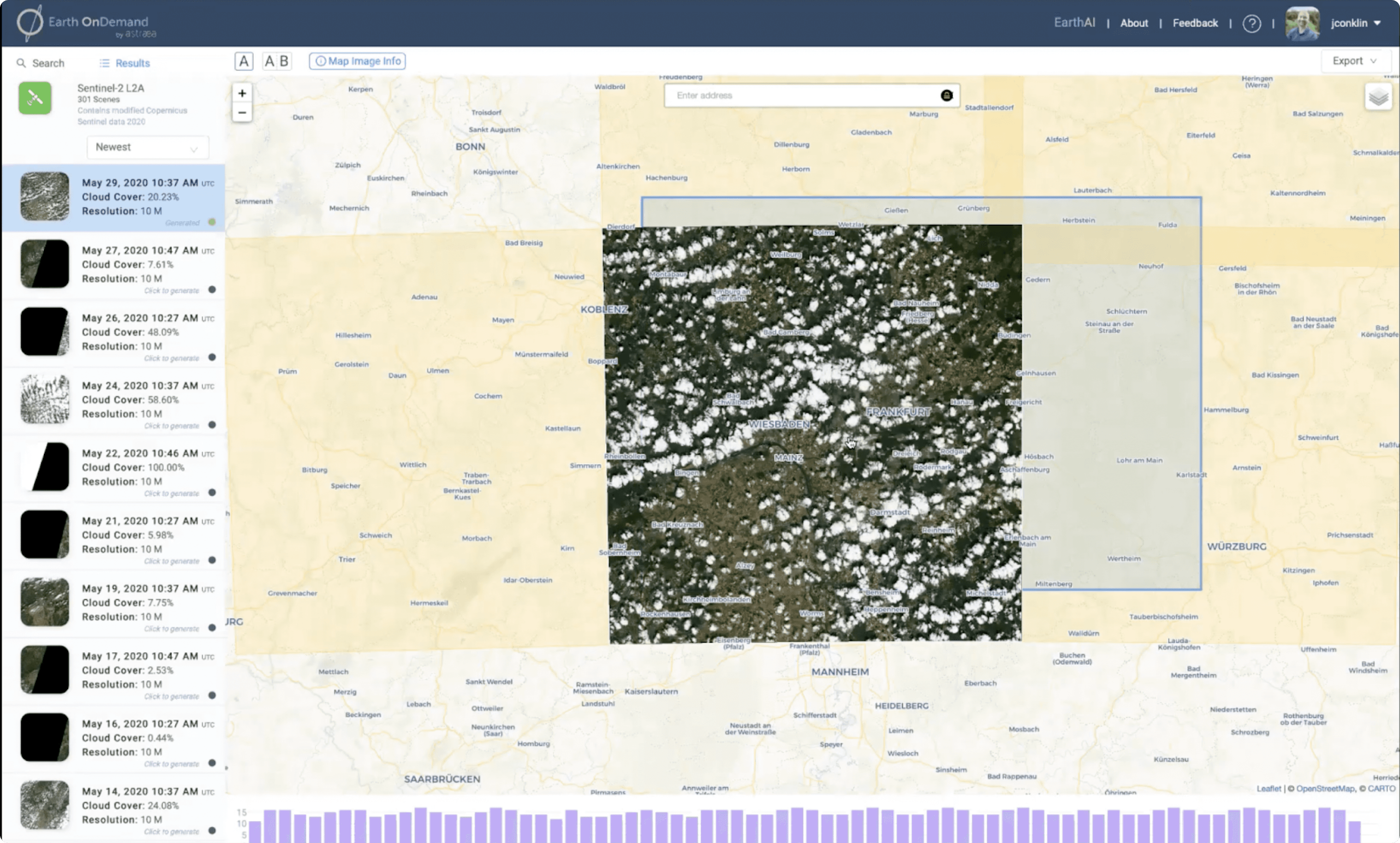
The original navigation — feature placement driven by build order, not user mental models
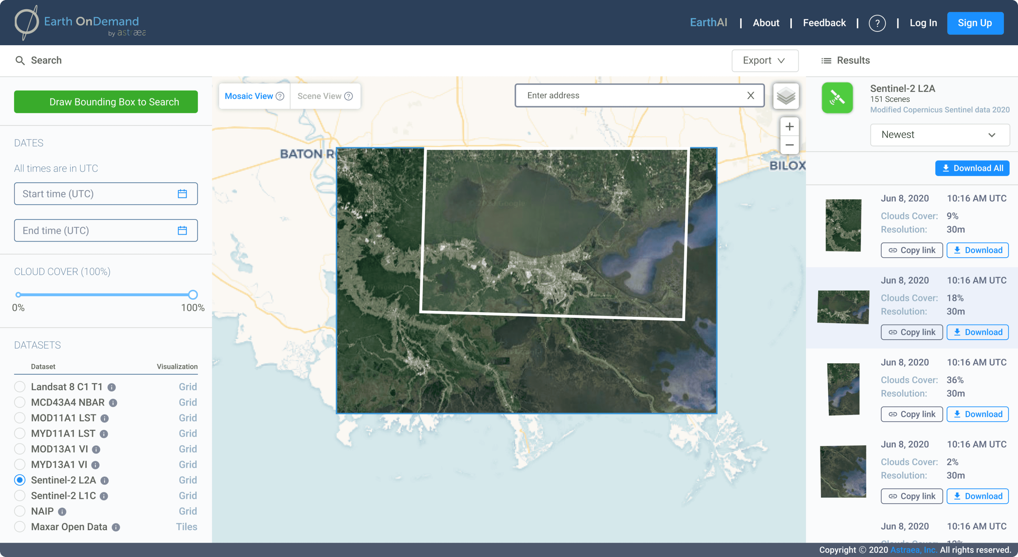
Reorganised around how users actually move through the platform
Design decisions
Three tracks
Navigation, monitoring, and a code editor — in parallel
The work had to move on multiple fronts simultaneously. Rather than sequencing the work linearly, I ran three parallel design tracks, each at a different stage of fidelity depending on how much was already defined. Navigation was a restructuring problem — the content existed, it just needed reordering. Monitoring was a build-from-scratch problem — we had data and engineering intent, but no UI. The code editor was a product design problem — we knew the capability, and the design had to make it feel purposeful, not bolted on.
Track 01
Navigation redesign
The existing navigation had grown organically, with features added where there was space rather than where they belonged. The redesign regrouped everything around what users were trying to accomplish — working with data, running analyses, reviewing outputs — not around when features had been built.
Track 02
Monitoring feature
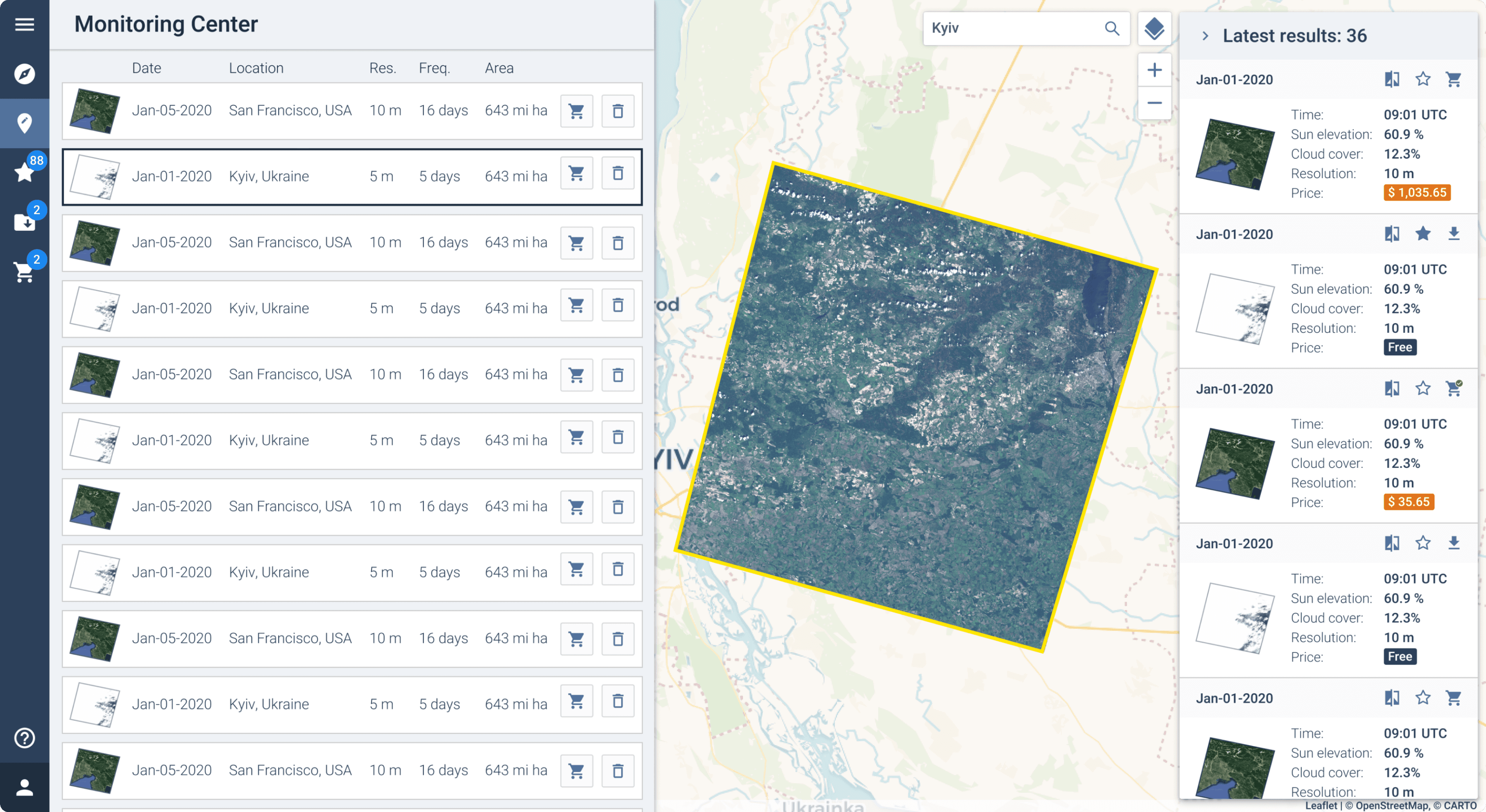
Astraea's backend infrastructure was sophisticated, but operators had no visibility into what was running, what had completed, or what had failed. I designed the Monitoring feature from scratch: a real-time view of data pipelines, processing jobs, and system status — giving users the confidence that the platform was working for them.
Track 03
Cloud code editor
For technical users — data scientists and researchers — the ability to write and run code against satellite data directly in the platform was a key differentiator. I designed a cloud-based code editor integrated into the platform, with syntax support, output panels, and a workspace model that fit how researchers actually work.
Navigation
Regrouped around jobs to be done, not build order
The original navigation reflected the order in which features had been implemented, not the order in which users encountered problems. Platform sections that belonged together — data ingestion and data management, analysis tools and job monitoring — were separated. New users had no mental model to anchor to.
The redesign grouped the platform into four clear areas: Data (ingesting, browsing, managing datasets), Analysis (running jobs, building pipelines), Monitoring (system health, job status), and Settings. The order mirrored the natural workflow of a new project: bring data in, analyse it, watch it run, configure your environment.
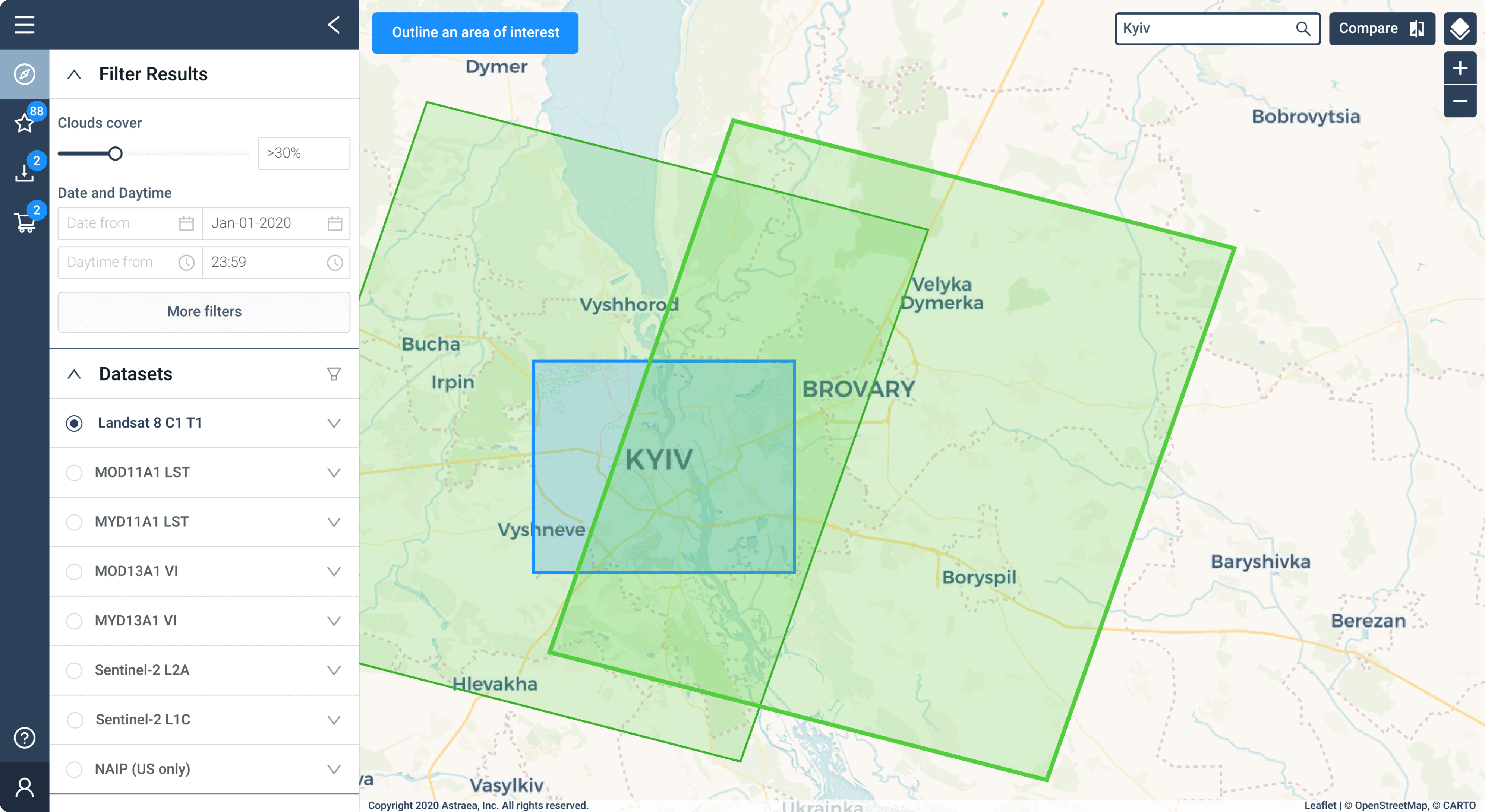
Left: original navigation. Right: restructured around user workflow — data in, analyse, monitor, configure.
Monitoring
Giving operators visibility into a complex backend
Astraea's processing pipeline was capable, but from the user's perspective it was a black box. You submitted a job and waited. If something went wrong — or if you just wanted to know how far along a large dataset was — there was nowhere to look.
The Monitoring feature gave users a live view of everything the platform was doing on their behalf: jobs queued and running, processing status by dataset, error states with enough detail to act on. For investor demos, it also served a second purpose — making the platform's technical sophistication visible in a way that felt impressive without requiring a technical explanation.
Live view of queued, running, and completed processing jobs
Drill-down view — dataset progress, processing steps, error detail
Summary panel — system health, recent activity, quick access to flagged items
Code editor
A cloud IDE designed for satellite data workflows
Power users — data scientists, researchers, engineers — wanted to write code against Astraea's data directly in the platform, without exporting to a local environment. The code editor brought that capability inside the product: a browser-based IDE with syntax highlighting, an integrated output panel, and a file system scoped to the user's datasets.
The design challenge was making something that felt like a real development environment — not a toy — while keeping it integrated with the platform rather than feeling like a separate application dropped in. The workspace model, the file browser structure, and the way outputs were displayed were all designed around how researchers actually iterate: write a little, run, inspect output, refine.
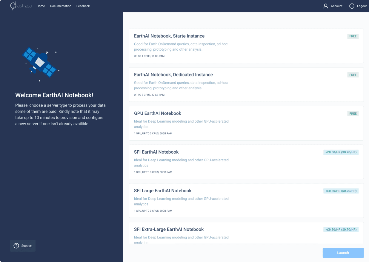
Workspace layout — code on the left, file system on the right
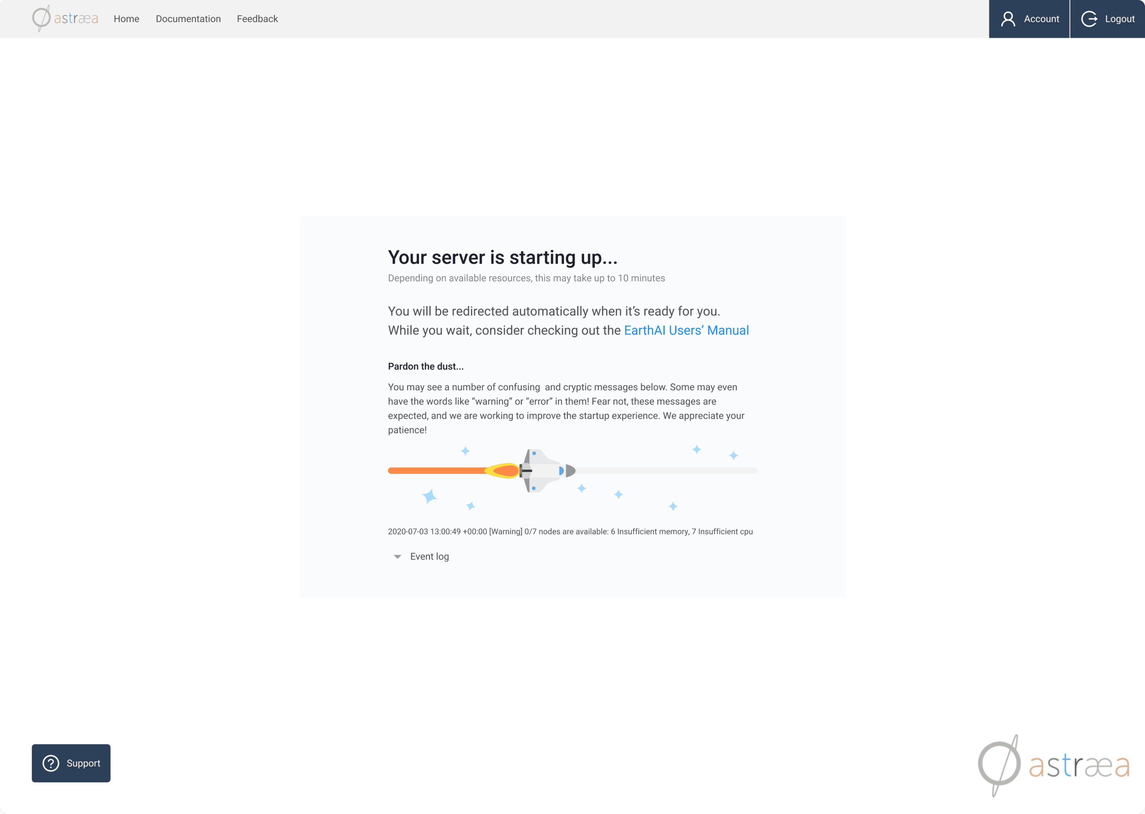
Inline output panel — results, logs, and error states below the editor
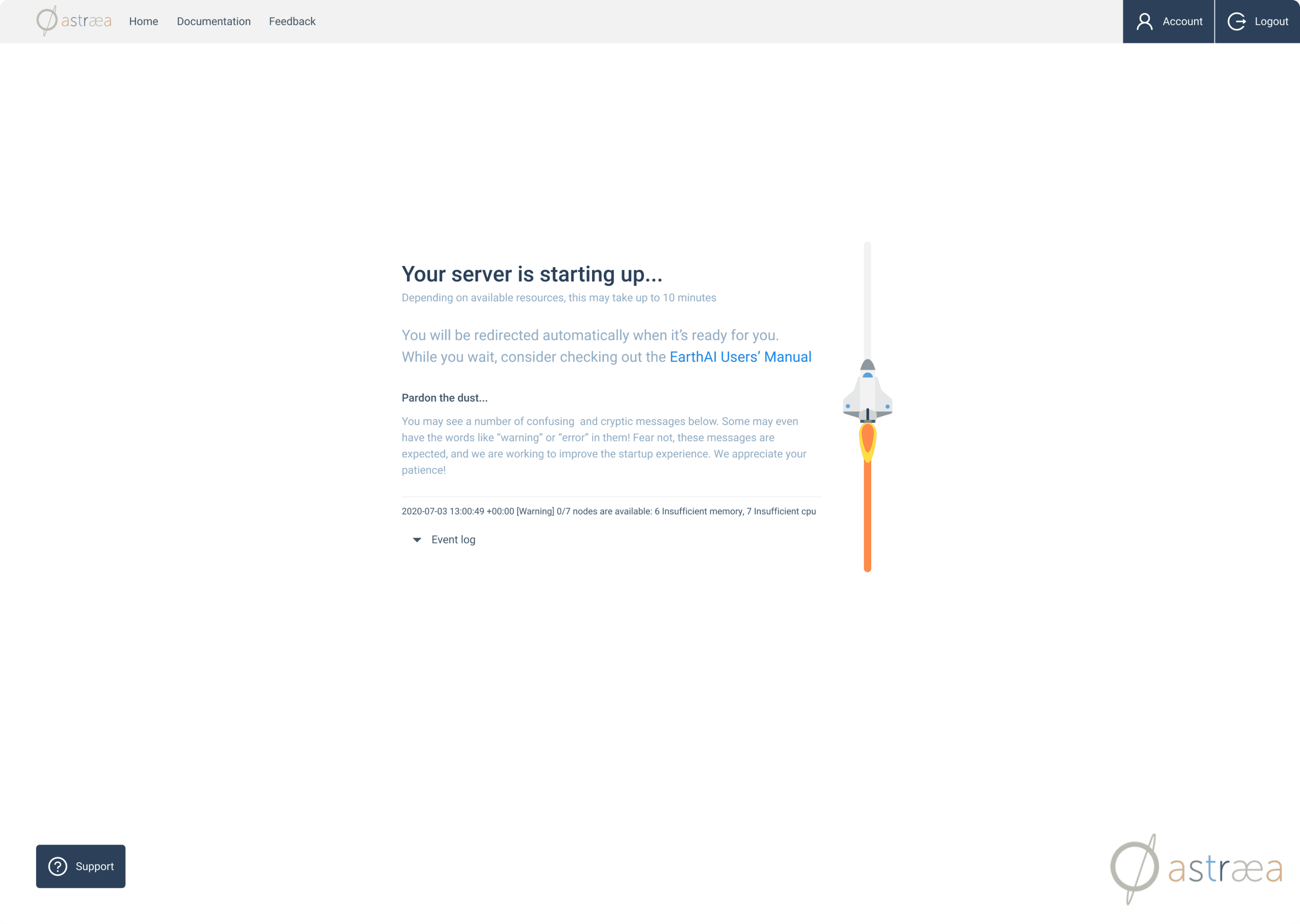
Dataset browser integrated into the workspace — write code, reference data, stay in context
Reflection
What I learned
Designing for investors is still designing for users — just with different stakes
This project sharpened something I've come to believe about design under pressure: when time is short, clarity is the only lever you have. You can't add more features, you can't run an extra round of research, you can't prototype your way out of a bad deadline. What you can do is make what's there coherent and understandable, and that's almost always enough, because most software problems are problems of clarity, not capability.
Previous project
Ricochet360
baida.masha@gmail.com